
Business Goal
Develop a highly dependable mobile app that empowers users to regulate their stress levels in real-time. By delivering science-backed stress-reduction tools through a frictionless mobile interface, the aim is to become the "daily-use" platform for high-stress professionals, driving long-term user retention and establishing brand authority in the proactive mental health space.
Process
Step 1: Defining Project Parameters
Timeline: Accelerated 10-Week Sprint: Managing a condensed delivery cycle from discovery through high-fidelity prototyping.
Scope: End-to-End Mobile Experience: Focused on the Primary User Flow (Onboarding to Intervention) to ensure a "Minimum Viable Experience" (MVE).
Assumptions: High-Intent Acquisition: Operating under the assumption of high user motivation, where users proactively seek stress-management tools via organic discovery.
Risks: Resource & Variance Management: Addressing potential "Scope Creep" within a fixed-budget and time-constrained environment.
Constraints: Market Saturation & Differentiation: Designing within a highly competitive wellness landscape, requiring a unique value proposition to ensure user adoption.

Step 2: Defining the Target Persona
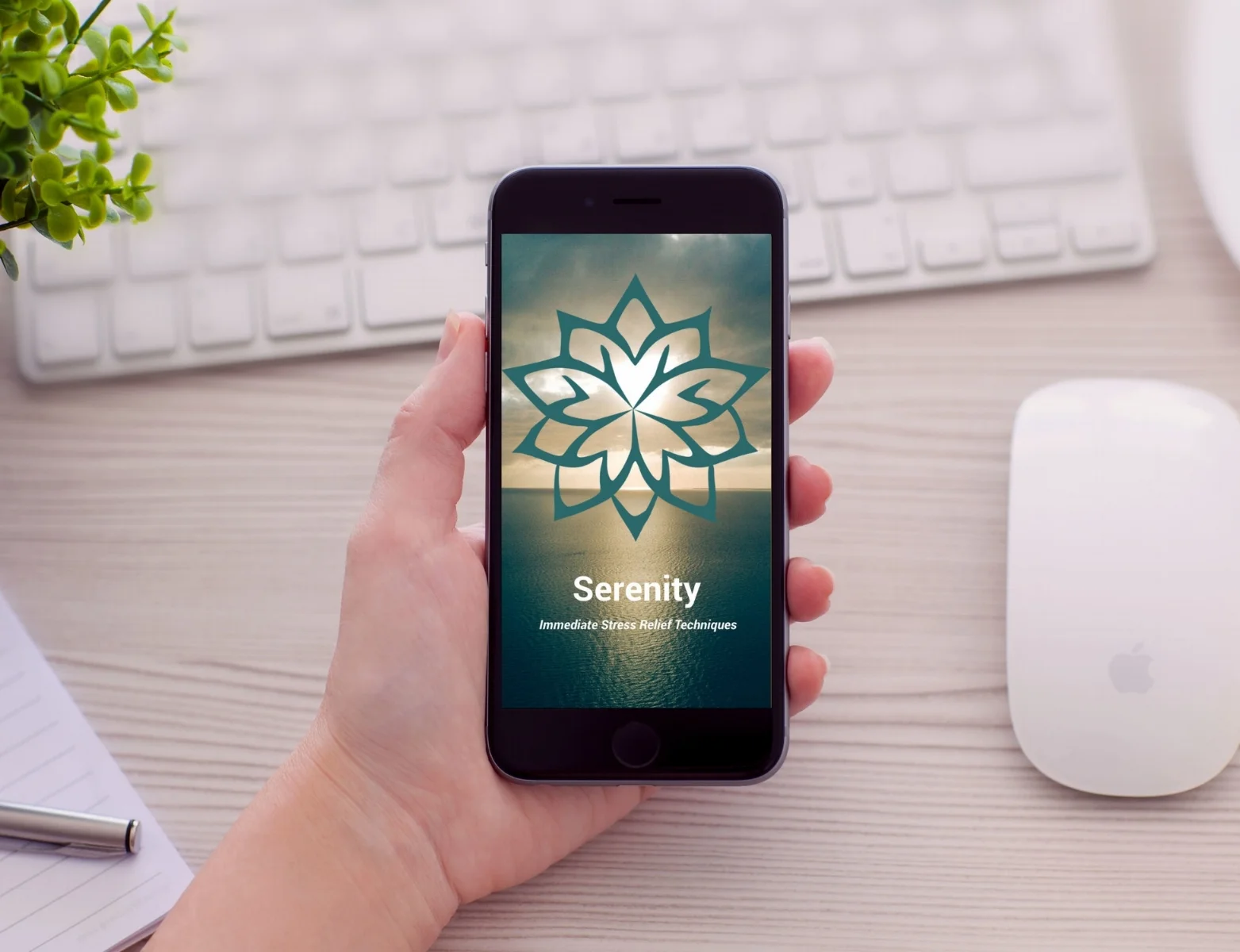
I synthesized my initial assumptions into a Proto-Persona to act as a benchmark for the app’s Information Architecture. The primary user—epitomized by Anne (at right)—represents the "Professional Multi-tasker": a college-educated individual balancing a demanding career with personal wellness goals.
The Strategy:
Objective Empathy: Using Anne’s profile helped me filter out "Nice-to-Have" features in favor of "Must-Have" stress interventions.
Validation: This persona ensured the design remained accessible across a wide age spectrum (25–65) while maintaining the sophisticated aesthetic expected by a professional audience.
““As a busy professional, I want to be able to reduce my day-to-day stress level so that I can feel better
and be more present with my loved ones.””
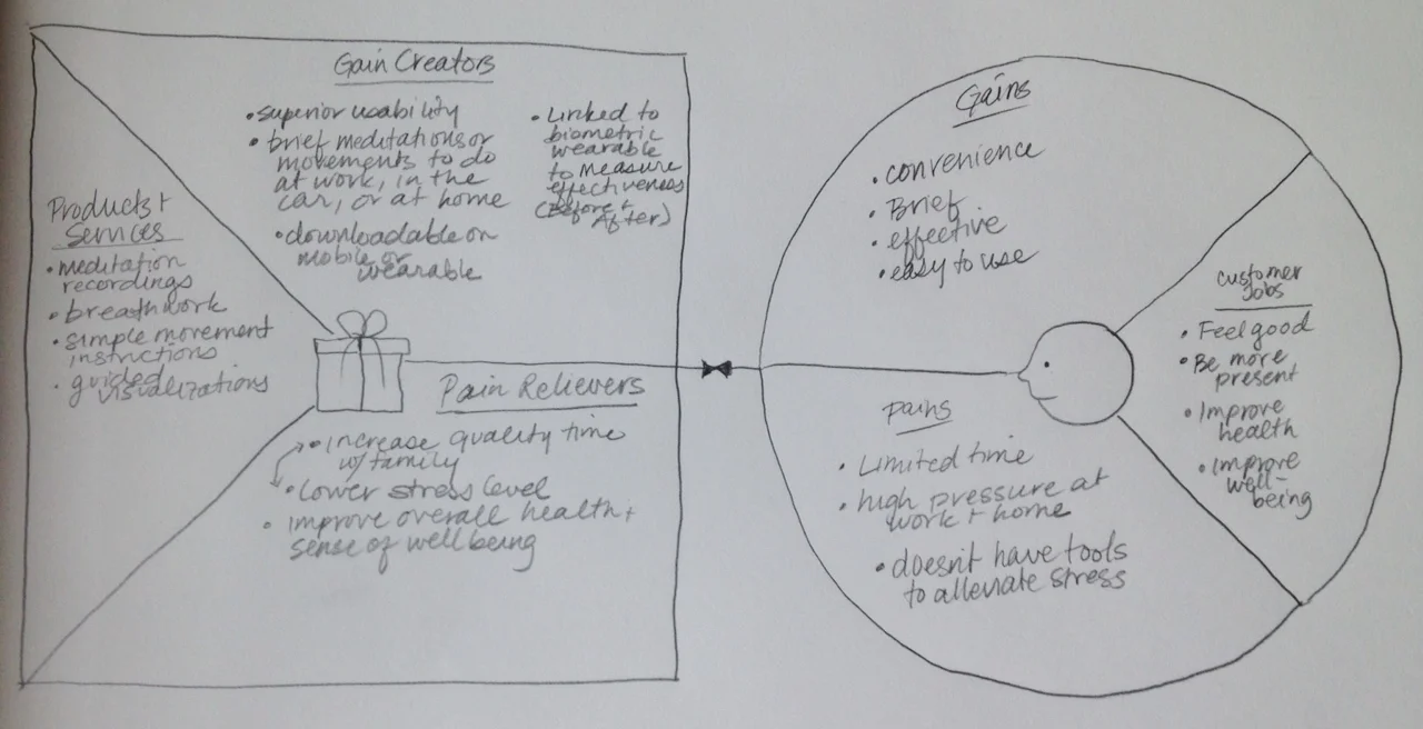
To bridge the gap between Anne’s current reality and her desired emotional state, I utilized a Value Proposition Canvas. This exercise allowed me to systematically map her "Pain Points" against potential "Gain Creators," ensuring the app's features were directly tethered to her psychological needs.
Strategy:
Mitigating Pains: I identified high stress and time scarcity as her primary barriers. The app's architecture was therefore designed to be low-friction and minimalist, offering intervention in under 60 seconds.
Optimizing Gains: Beyond just lowering stress, I focused on increasing quality time with family and improving overall health.

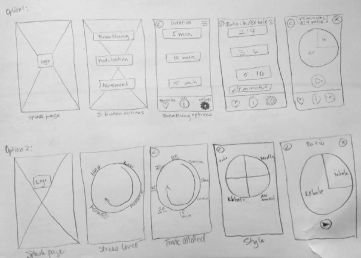
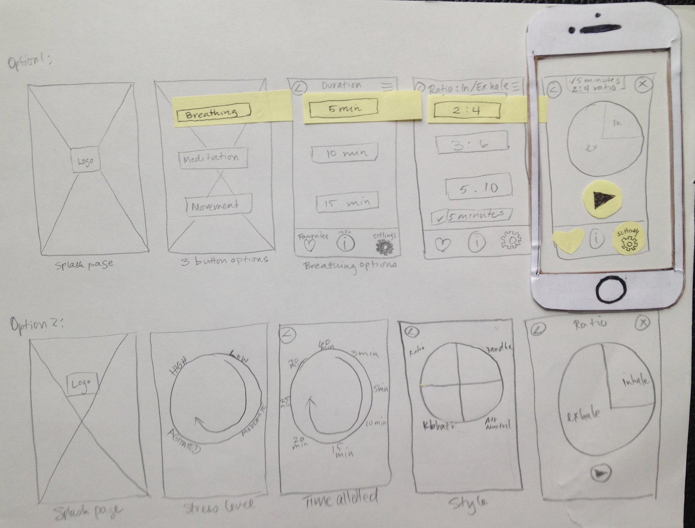
Step 3: Architecting the Experience
I created hand-sketched wireflows to bridge the gap between user needs and technical requirements. This allowed me to visualize the functional hierarchy of the Serenity app in real-time.
Goal: To define a "Minimum Path to Value"—ensuring that a stressed user can find relief in three taps or fewer.
Process: I experimented with various navigation models to determine which offered the least intrusive experience for someone already experiencing high anxiety.
Result: These sketches served as the architectural blueprint for the digital wireframes, ensuring that the core UX logic was sound before any pixels were moved.

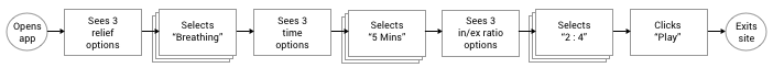
Step 4: Diagramming Task Flows
After iterating on my sketches, I converged on a single, streamlined user journey. My goal was to establish a "Critical Path" that minimized the time between app-launch and stress-mitigation.

Step 5: Paper Prototyping
I used paper prototypes to conduct early-stage usability testing with my target demographic. By stripping away the visual layer, I was able to observe how users interacted with the core Information Architecture and wayfinding logic.
Task-Based Testing:
Discovery task: Participants were asked to locate a specific breathing technique within the app. This tested the efficacy of my content categorization.
Customization task: Users were tasked with modifying session settings. This allowed me to evaluate the mental model users have for app preferences and control panels.
This analog approach allowed for real-time iteration. If a participant struggled with a button placement, I could physically redraw and replace that element mid-session, instantly validating a new solution.
Step 6: Iterating Based on User Feedback
““I’d expect to see some indication that the timer is moving as I’m breathing””
Response
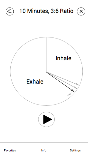
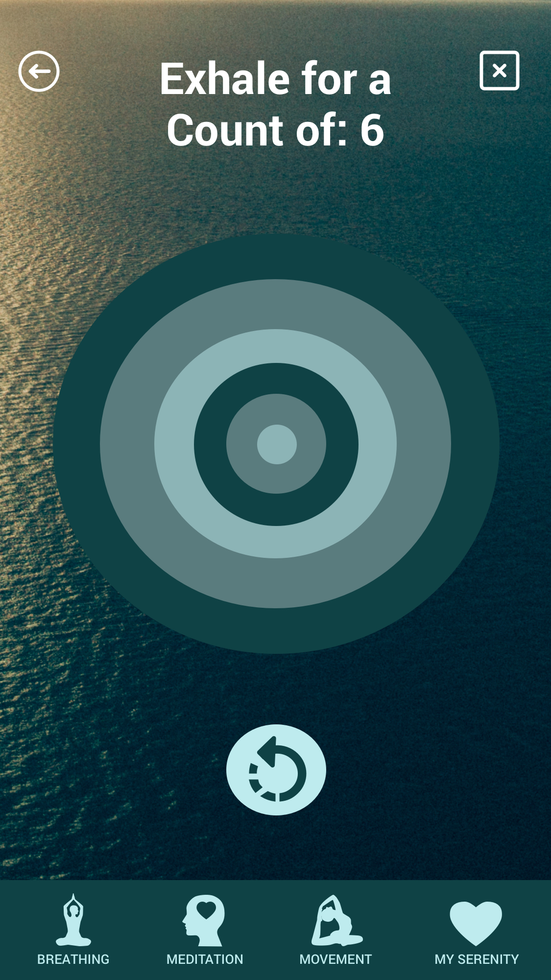
I developed a synchronous visual metaphor where the UI elements move in alignment with the recommended inhale/exhale ratio.
Hi-Fidelity
In my first iteration of high-fidelity prototypes, I explored using an expanding and contracting circle to guide the user. The organic movement mimics the lung’s natural physiology, reducing the mental translation required to follow a numeric timer.
I also integrated shifts in color to signal the transition between breath phases. This provides an ambient feedback loop, allowing the user to follow the guide using peripheral vision while maintaining a relaxed, soft focus.
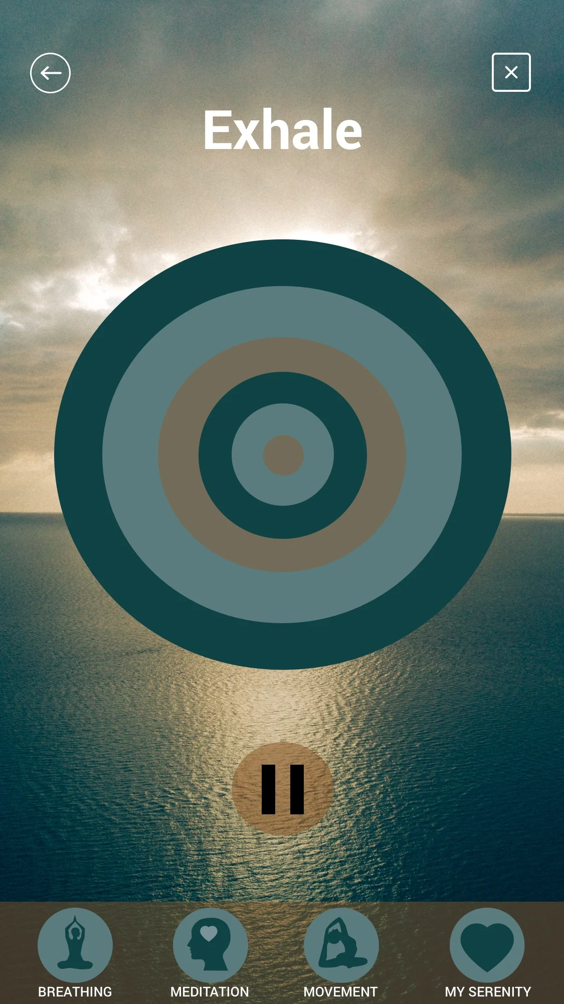
““The icons seem a little dark for easy accessibility.””
Response
Based on user feedback regarding low legibility, I systematically increased the contrast ratio of all core action icons. This ensures that the app remains functional for users with visual impairments or those viewing the screen in high-glare environments.
I refactored the background image composition to create a clean zone at the top of the screen. In doing so, I eliminated visual interference with the global navigation, ensuring that the upper commands are immediately scannable.
I also moved to a monochromatic+ color scheme, reducing visual noise and allowing the primary call-to-action (CTA) to stand out more effectively.
Key outcomes
Reduced Interaction Fatigue: By streamlining the "Golden Path," users like Anne can initiate a breathing session easily, ensuring the app remains a help, not a hurdle, during peak stress.
Visual-Physical Synchronicity: The transition to rhythmic, high-contrast visual cues resulted in a more intuitive user experience, allowing for deep immersion without cognitive over-processing.
A Sustainable Ritual: While Anne’s professional landscape remains demanding, the Serenity mobile app provides the predictable digital architecture she needs to maintain mental resilience throughout the day.
Watch the Serenity app in action below: