
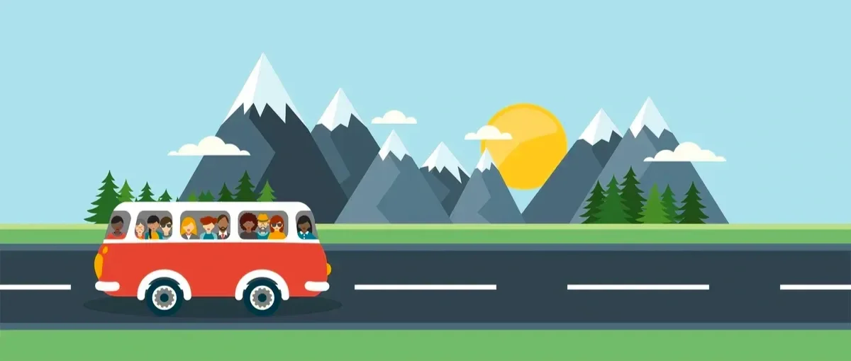
Elevator Pitch
JoyRide leverages emerging autonomous vehicle (AV) technology to transform long-distance travel from a solitary task into a high-value social experience. By facilitating AI-driven passenger matching, JoyRide fosters meaningful connections while optimizing the efficiency of autonomous transit.
Concept: A Closer Look
As self-driving technology removes the "cognitive load" of driving, a new opportunity emerges for the in-cabin experience. JoyRide is a peer-to-peer mobility platform that matches travelers based on shared social graphs and interests. By automating the journey, we re-prioritize human connection—offering a cost-effective, sustainable, and social alternative to traditional air and rail travel.
My Role
My primary focus was to design and test a frictionless, trust-based mobile app experience. In a "driverless" environment, onboarding is the most critical moment for establishing safety, verifying identity, and aligning passenger expectations to ensure a harmonious journey.

Target Audiences: The "Digital Nomad" & "Social Explorer"
To ensure a successful launch, JoyRide targets a specific segment of early adopters whose lifestyles are defined by mobility, community, and tech-fluency.
Primary Demographic: Adults aged 25–35 who are established in their careers and prioritize new experiences.
Psychographic Profile: They are adventuresome and socially motivated, viewing the journey as a integral part of the destination. They are comfortable with the "Sharing Economy" (Airbnb, Uber) and are looking for more authentic ways to connect.
Behavioral Patterns: Frequent long-distance travelers who currently juggle the high costs of flights or the physical exhaustion of solo driving. They are "Tech-Optimists" ready to embrace autonomous transit as a lifestyle upgrade.
Context Scenario
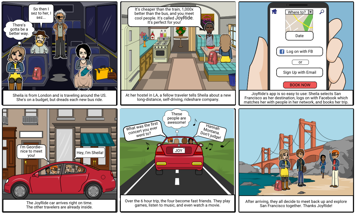

Onboarding:
User Insights
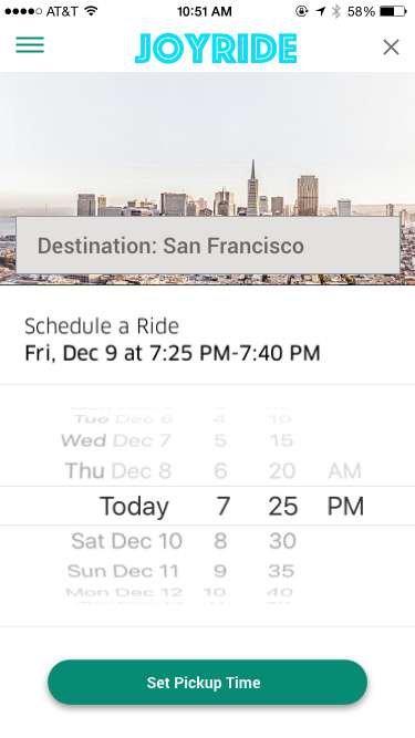
Users were asked to perform the task of finding a JoyRide from LA to SF on Aug. 24.
Testing revealed that the initial search flow was too "steppy," causing users to lose context between screens.
Wireframe feedback
A user commented, “I would expect to see the Departure, Destination, and Date on the same page.”
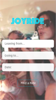
Response
Departure, Destination and Date were merged into a single-screen search screen. Grouping related inputs allows for immediate error-checking and faster entry. By eliminating unnecessary screen transitions, the "Time-to-Match" was reduced, and a more "frictionless" onboarding experience was created.
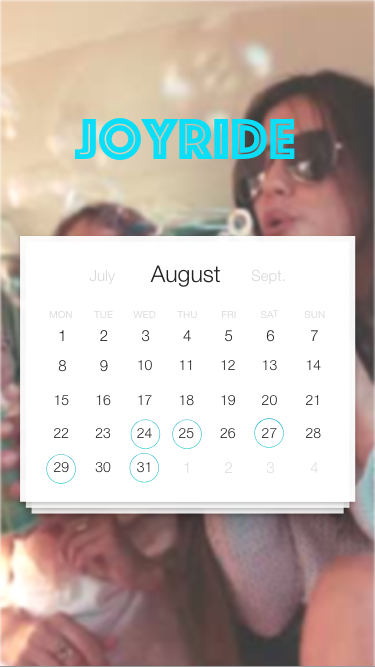
2nd Iteration feedback
“This Datepicker might be hard to use if you were planning a trip a couple of weeks in advance.”
Response
To reduce the high cognitive load caused by "Calendar Math" (e.g., “Is the 24th a Friday or a Saturday?”), I implemented a dynamic calendar-based datepicker. This provides immediate visual feedback on the day of the week and allows for rapid "Range Selection."
By providing a familiar mental model, "Booking Hesitation" was reduced and ensured users could confidently schedule trips around their existing social and professional commitments.
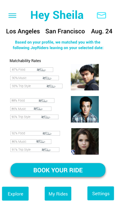
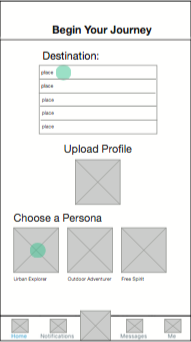
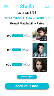
3rd Iteration feedback
Feedback from the third iteration indicated that the ride-matching interface was "over-designed." One participant noted: "I thought the infographic was clickable."
Response
The complex graphic lacked clear signifiers. Its prominence suggested interactivity where none was intended.
The Solution: I shifted to a minimalist information display, replacing the misleading infographic with a clean, scannable list of matching criteria.
Result: By prioritizing "Signal over Noise," I improved the screen's scannability and ensured that every visual element served a functional purpose, significantly reducing user error.