Project Background & Goal
As Nikon celebrated its centennial milestone, the brand recognized a pivotal shift in the imaging landscape: the need to transition from a hardware-centric model to a user-centric digital ecosystem.
Following Nikon’s 2017 strategic mandate to prioritize global usability, I conducted a deep-dive audit of their Information Architecture (IA). My objective was to reconcile a century of technical authority with modern digital expectations, creating a seamless, intuitive experience that serves both professionals in the field and the emerging hobbyist.
The Problem
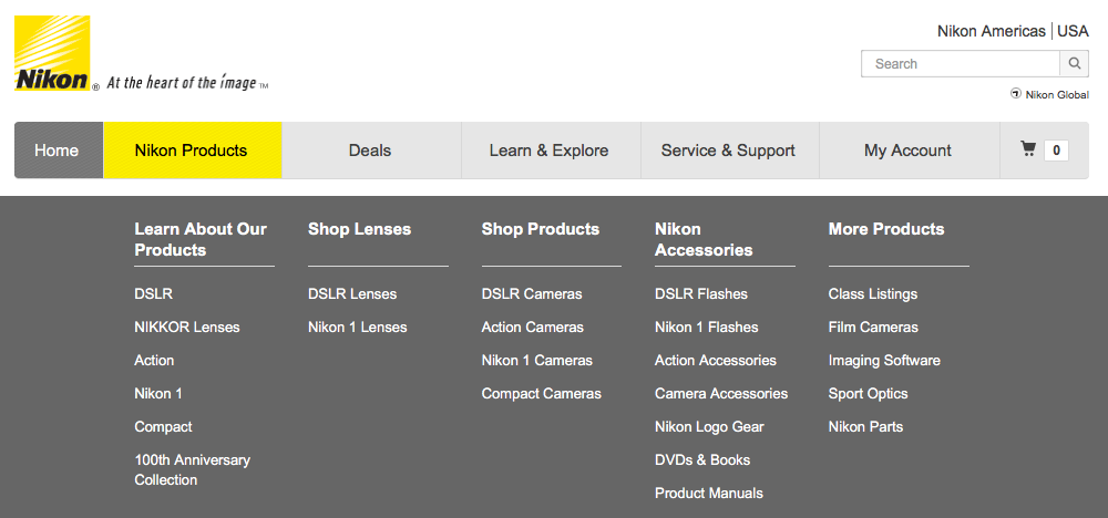
The Nikon site’s architecture overwhelms users with an excessive volume of top-level navigational choices. This creates significant cognitive load, forcing users to expend mental energy on "wayfinding" rather than product discovery.
Furthermore, the system lacks a task-oriented framework, resulting in high friction for users attempting to execute core actions, such as comparing hardware or accessing technical support.
Process
Step 1:
Foundational Research & User Discovery
To establish a data-driven baseline for the redesign, I took a mixed-methods research approach. By triangulating qualitative and quantitative data, I was able to identify high-level user goals and the specific pain points within the current Nikon ecosystem:
Qualitative Interviews: I conducted deep-dive sessions with photographers to uncover their mental models and decision-making flows.
Quantitative Surveys: I deployed a survey to validate the prevalence of identified friction points across a statistically significant user base.
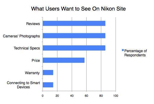
My research identified three critical content pillars that dictate the user's decision-making process. Participants indicated that their "Confidence to Purchase" was directly tied to the accessibility of:
Reviews: Validation from peers and professionals to mitigate financial risk.
Sample Imagery: High-fidelity evidence of the sensor’s capabilities and "real-world" output.
Technical Specifications: Granular data required to verify compatibility and performance benchmarks.
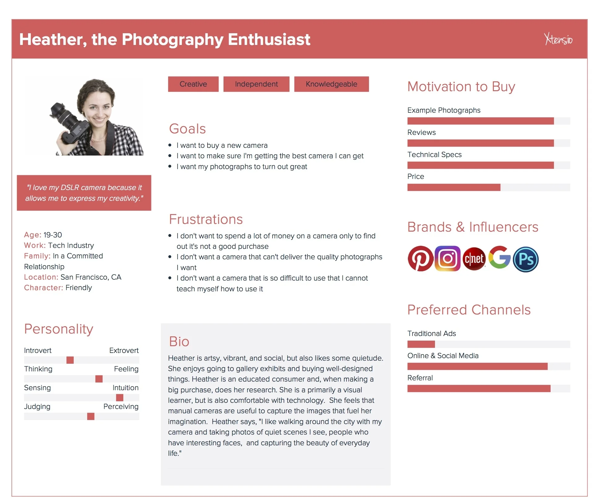
I developed a user persona to act as a North Star for the redesign. This archetype moved beyond basic demographics, focusing instead on behavioral drivers, technical requirements, and other barriers. By anchoring the design process in this data-driven persona, I was able to maintain empathy and ensure that every architectural decision directly addressed user pain points.

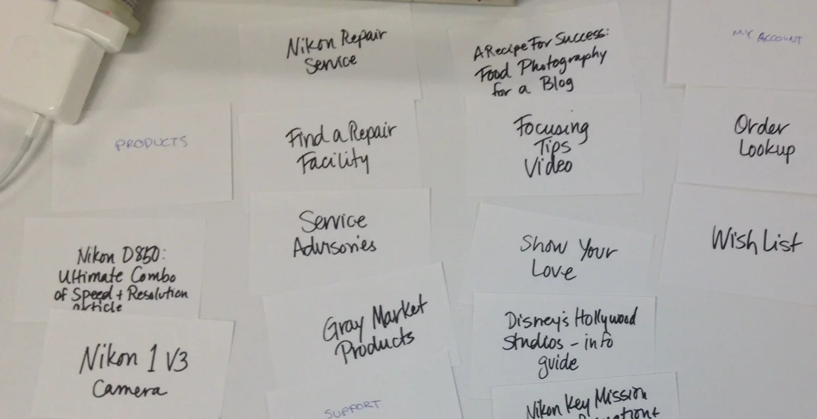
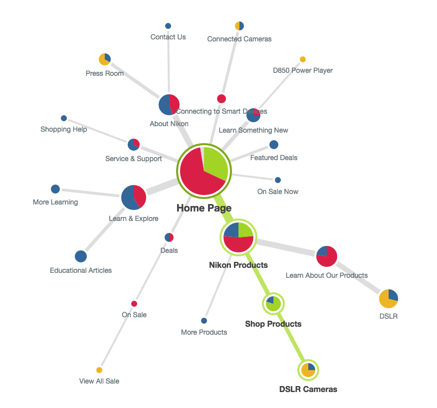
Step 2: Tree Testing
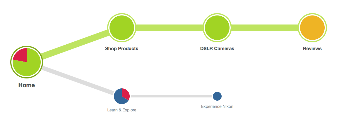
To quantify the efficacy of the existing IA, I conducted a Tree Test centered on primary user tasks. This method allowed me to isolate the site’s hierarchy from its visual design to measure true "findability."
Key Finding: The results surfaced critical navigational friction: only 21% of participants successfully located “Reviews,” despite it being a top-three user priority. This 79% failure rate indicates a profound misalignment between the site’s taxonomy and user mental models, confirming that high-value content is effectively "hidden" from the intended audience.
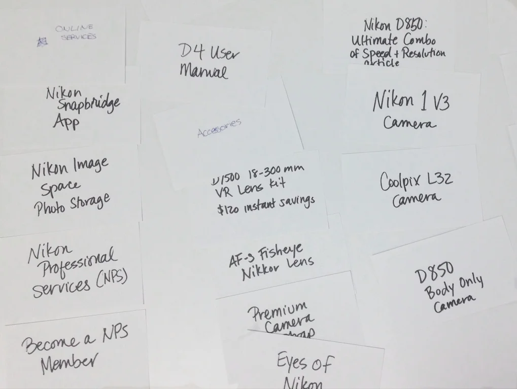
Step 3:
Ideate on Label Names & Site Organization
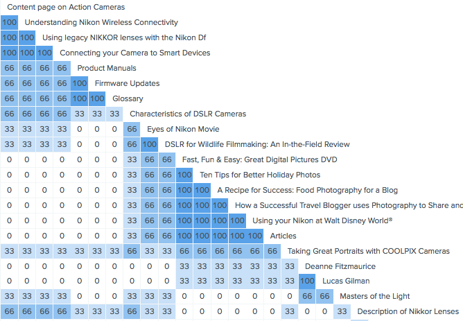
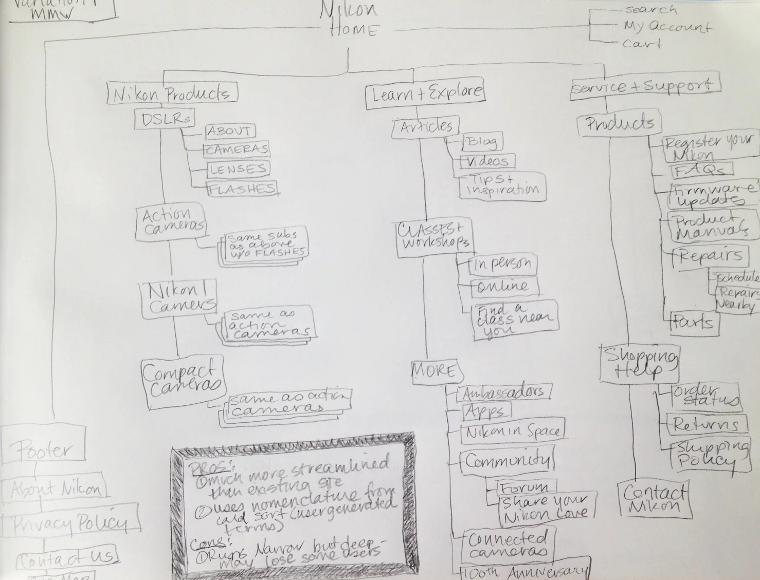
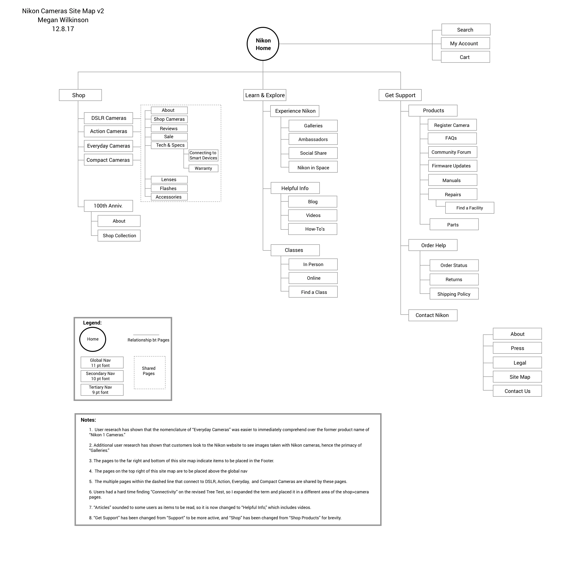
Following the Tree Test, I utilized Card Sorting to identify the optimal hierarchy for a restructured IA. The study highlighted two major opportunities for improvement:
From Branded to Descriptive: Users struggled with Nikon's category names. By replacing ambiguous labels like "Fast, Fun, and Easy" with descriptive terminology like "Articles & News," the site would better align with established web conventions.
Lens Consolidation: My research also confirmed that users expect a centralized Lens ecosystem. Merging the fragmented lens pages into a single "Lenses" directory would reflect the mental model of photographers who view lenses as a distinct, unified category of hardware.
Step 4:
Site Redesign
Using my research data, I drafted a series of IA Blueprints. The strategy was defined by three core pillars:
Choice Architecture: I refined the horizontal navigation to minimize "Decision Fatigue," replacing the exhaustive existing menu with a curated, high-impact selection of categories.
Contextual Consolidation: I identified and removed redundant data paths, grouping related services (like Lenses and Accessories) to better reflect user mental models.
Optimized Wayfinding: I intentionally increased the visibility of "High-Intent" anchors—Reviews and Technical Specs—to satisfy the primary goals identified in the discovery phase.

Step 5:
Validation
To verify the efficacy of my proposed architecture, I conducted a follow-up Tree Test using the same high-intent tasks from the initial study. The results provided a definitive validation of the new taxonomy structure:
"Reviews" Success: From the primary friction area identified during discovery, the Success Rate increased from 21% to 100%.
Eliminating Findability Barriers: By aligning the nomenclature with user mental models and elevating high-intent content, I successfully removed the "Discovery Bottleneck" that previously hindered the user journey.
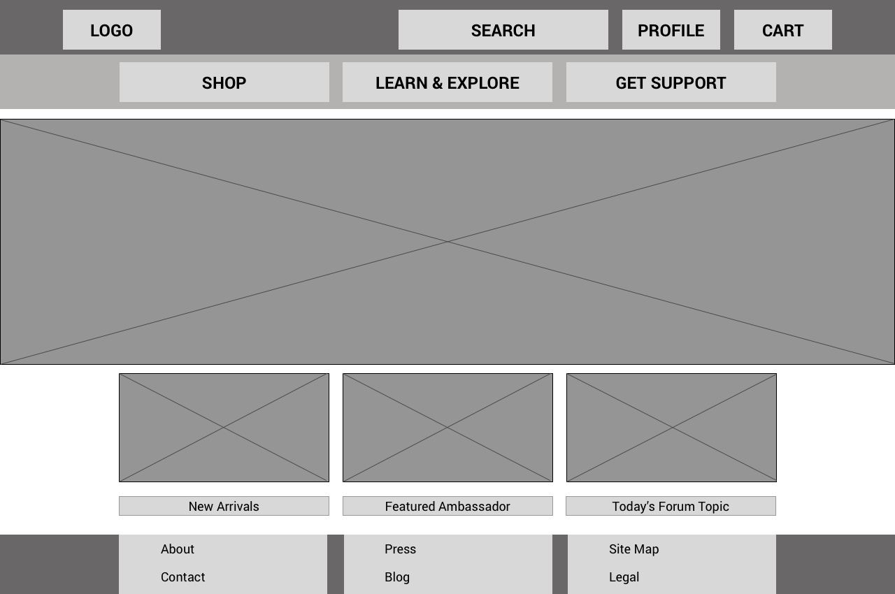
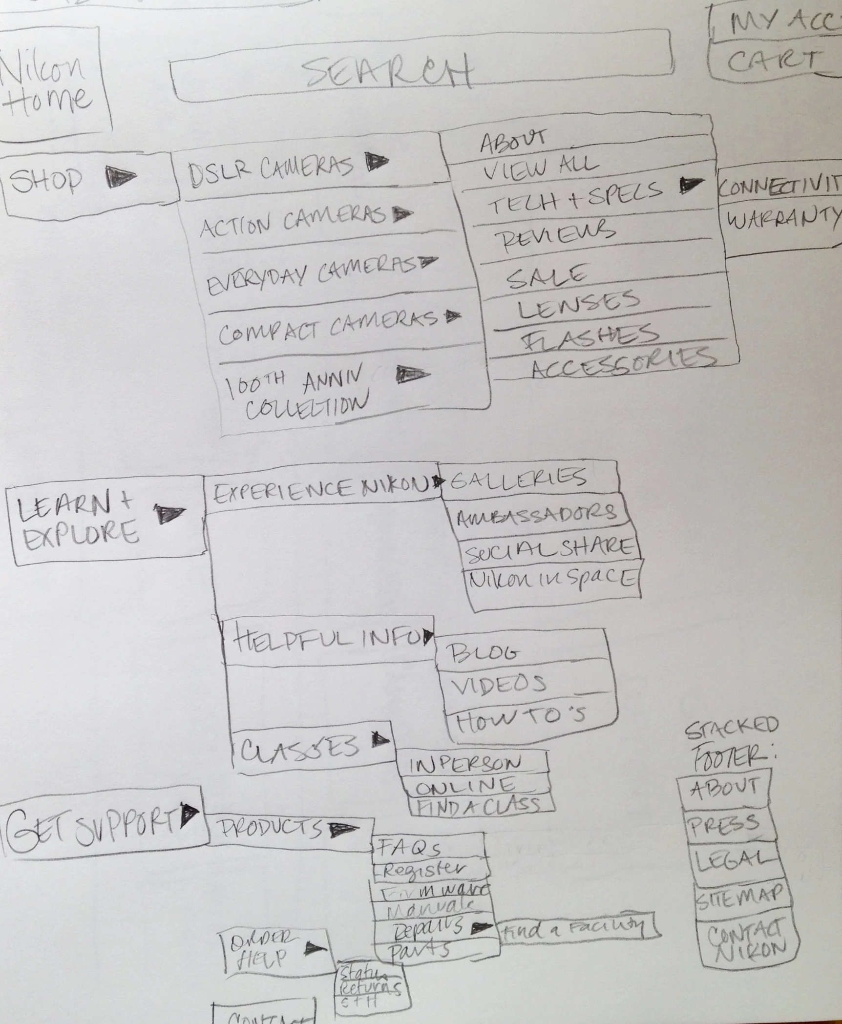
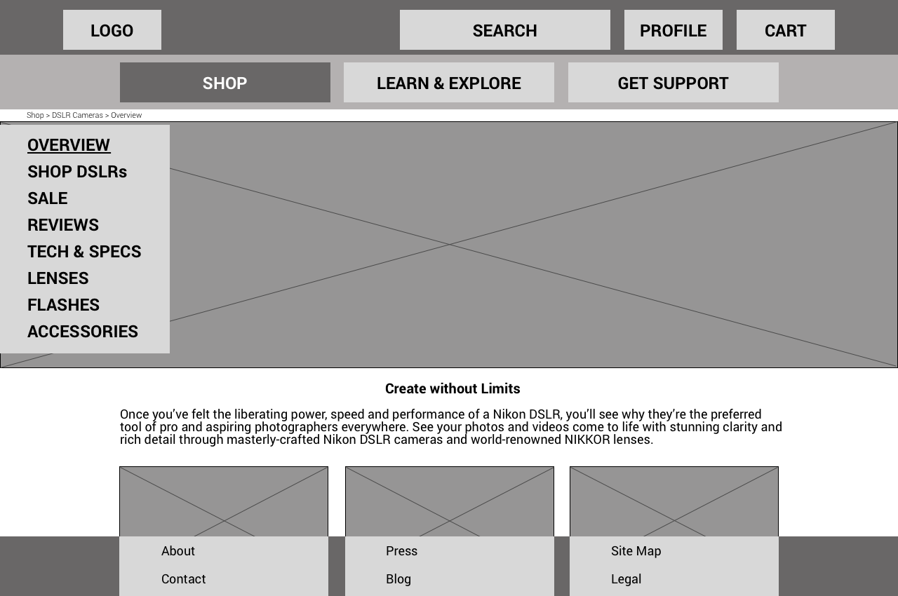
Step 6: Low-Fidelity Wireframing & Information Hierarchy
With a validated IA in place, I transitioned into structural prototyping. I developed low-fidelity wireframes to define the functional layout and content prioritization of the key landing pages.
By utilizing a "Grayscale" approach, I ensured that stakeholders remained focused on navigation flow and content placement rather than aesthetic preferences.
I used these wireframes to codify the new hierarchy, ensuring that the "High-Intent" elements identified in research—Reviews, Specs, and Galleries—were granted primary visual real estate.
This phase allowed me to test how the consolidated global navigation would adapt to smaller viewports, ensuring a consistent experience across all devices.
Outcomes
The redesigned Nikon Information Architecture successfully transforms a complex content library into a high-conversion user journey. By grounding the design in behavioral data, I moved the platform from a "catalog-centric" model to a "task-centric" ecosystem.
Key Outcomes:
Cognitive Efficiency: The streamlined navigation reduces "Decision Paralysis," allowing users to navigate through high-intent paths (like Reviews and Tech Specs) with zero friction.
Visual-First Discovery: By elevating Sample Galleries in the site hierarchy, the interface now leads with the brand's greatest asset—image quality—directly satisfying the primary user goal of optical validation.
Business Alignment: These optimizations directly fulfill Nikon’s 2017 mandate for global usability, protecting the brand’s market share by offering a digital experience that matches the precision of its hardware.